Note: Hey, you know how you’ve been getting three of these Land Desk dispatches each week? And how they pile up in your inbox and you fall behind on your reading? I’m here to help! As of this week, the Land Desk will publish just twice weekly, usually on Mondays and Fridays (but not always). And I reserve the right to send you a third or even fourth dispatch if events and news warrant! If it seems like it’s not enough, please let me know, and I’ll increase the frequency again.
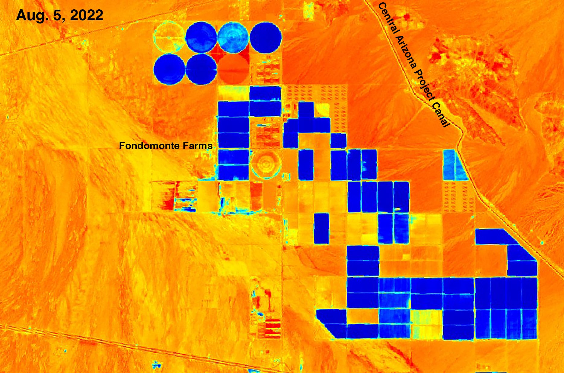
How does the saying go? “Give a guy a map and he’ll peruse for a day; give a guy Google Earth and he’ll waste his life away.” Something like that. Anyway, I’m Mr. Land Desk, and I’m a satellite map addict. I love the the things and could spend days—and sometimes have—virtually exploring mountains, deserts, and cities. Even more addicting are the layers some applications allow you to add: oil and gas wells, census stats and, featured in today’s dispatch, vegetation and moisture indices.
Lately I’ve been messing around with the Sentinel Hub Playground, which is, indeed, a playground for folks like me. You just punch in the name of where you want to go, and there you are. It’s not Google Earth—the resolution is far lower. But what it lacks in clarity and zoomability, it more than makes up for. First off, Sentinel Hub allows you to pick the date of the imagery you want to see (Google Earth imagery is usually a couple of years old or more). Second, you can view the maps through different lenses, like the Color Infrared (Vegetation) effect, or the Moisture Index.
And that allows you to get a sense of how the drought is affecting different places. I did some of this about a year ago to illustrate the concept of water inequality. Today, I’ve got a gallery of images to illustrate drought and water use—sometimes profligate. But that’s enough words. Let’s get to the pictures. Note: You can see the photos much better at LandDesk.org.
First, a color infrared image of southwestern Colorado, with red=vegetation.
I’m starting with this one because it’s a good reminder that, despite this year’s decent monsoon, there’s still a serious drought on. This shows the far southwest corner of Colorado in 2019 and 2022. The circles are center pivot-irrigated fields of the Ute Mountain Ute Tribe Farm & Ranch Enterprise. The water comes from McPhee Reservoir on the Dolores River. In 2019, a massive snow year filled the reservoir to the brim and then some, allowing all its users to get a full allotment of water. But the winters since have been meager and the lake low. While senior water rights holders get enough to keep their alfalfa green, the Ute Mountain farms only receive a fraction of their allotted amount, meaning they have to fallow many of their fields. The red shows vegetation.
This one, which is not an infrared image, may make you see red. Or blue. Or something. This is a Moisture Index image showing a bunch of alfalfa fields in the middle of the desert in La Paz County, Arizona, in which blue=soil moisture. The irrigation water comes not from the Central Arizona Project Canal (despite its close proximity), but from groundwater wells which are not monitored or regulated. Which means that while Colorado River water users (like the Ute Mountain Ute Tribe) are forced to stop irrigating, these farmers can keep growing alfalfa till the cows come home, so to speak. Did I mention that the fields are owned by Fondomonte Farms, a subsidiary of Saudi Arabian food and beverage giant Almarai? All of the alfalfa grown on these farms is shipped to Almarai’s dairies to feed some 100,000 cows. Source: Sentinel Hub
This is a color infrared image of the Coachella Valley (Palm Springs is just off the top of the map) in Southern California. It’s a desert, of course, but with the help of Colorado River water folks can grow thirsty crops here, keep the myriad golf courses emerald green and lush, and even have housing developments with lakes and ponds in them. The 270,000 people in the Coachella Valley Water District consume more than 300 gallons of water per day per capita, making them some of the most profligate water users in the state.
This is a zoomed in Moisture Index version of the previous image showing golf courses, resorts, and housing developments.
This color infrared vegetation image of San Juan County, New Mexico, shows that the Navajo Agricultural Products Industry, which gets water from the San Juan River, is weathering the dry times just fine—so far. An image from 2019 is nearly identical to this one.
And, finally, a moisture index map of agricultural zones of La Plata County, Colorado, in 2021 and 2022, shows that even though the region remains in drought, it is far better off this year than last year, water-wise. Last August the Dryside (along the La Plata River on the left side of the image) really lived up to its name. This year it appears as if the irrigation is flowing. Same goes with Florida Mesa and the Los Piños River drainage on the right.
Lol, Jonathan, I got up at 5:00 specifically to catch up on my land desk reading and opened the aridity/water abuse maps and got sucked in for a half hour just looking at maps.
Amazing work!